WeTransfer
Surfacing Plus features in WeTransfers iconic transfer box
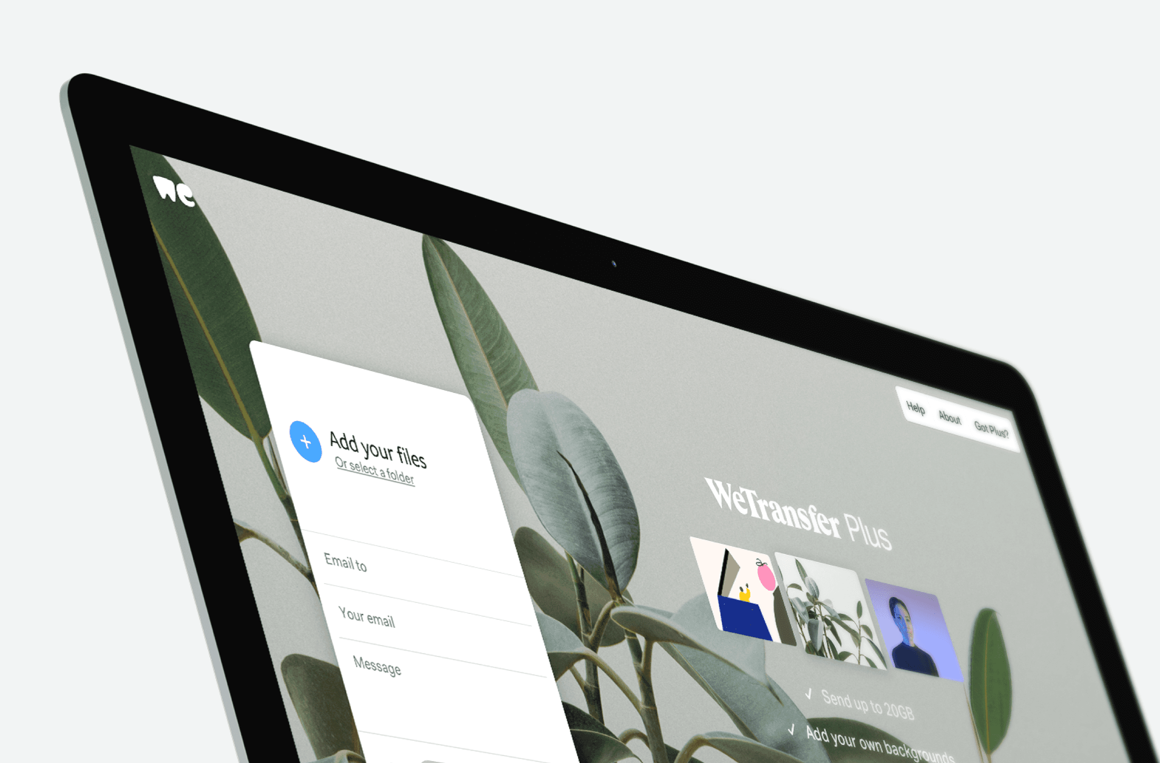
The Transfer Box, the window you upload files through, is the most iconic part of WeTransfer’s interface. As part of my work on acquisition for WeTransfer Plus, I explored how it could surface the Plus features without changing its shape.
Problem
Plus features, such as longer expiry dates and password-protected transfers, sat below the visible area of the Transfer Box. Our assumption was that the sooner users could see them, the more likely they were to upgrade.
Constraints
Why not make the Transfer Box taller? Its proportions were inspired by the original iPod and became a signature part of the WeTransfer brand. A taller box would go against the brand guidelines and take space from the advertising on the wallpaper background. The Transfer Box has gone through several evolutions since, but its size has stayed the same.
Exploration
I explored several directions, first as designs and then as interactive prototypes in Principle, before presenting them to the team. We landed on three variants, each a different answer to the same question, designed to be A/B tested against each other.
Result
Rather than betting on one answer, the three variants turned an assumption into something the team could measure.